3.1 Compare good and poor typography on websites
Bad typography design
I found this website via norskenettsider.no (also a website that lacks good design) and my first thought was that this website didn’t load the CSS-file since it looks like a very simple website made using only HTML and styling with HTML.


Why this typography is bad:
- Same serif font all over the page (appears to be Times New Roman)
- The logo has got the font Comic Sans, a very dated font
- Small font size on the whole website
- Text going all over the page (from the furthest left to the furthest right) making it harder to read since you need to move your head and eyes so much
- When hovering over the text in the list, the text becomes a light yellow which has got bad contrast to the white background
- The text in the list are all underlined
- Some of the text doesn’t even show until you randomly hover over it (for example the second list item, under “Nyeste”)
- When scrolling a little bit further down, a lot of the text becomes red. Some of the text is shaded with the red color as shading and white as the text color. This is too much contrast and hard on the eye.
I would have guessed that this is an old website that isn’t in use anymore, but the posts are from this year so the website is very much in use.
Good typography
I found this website through Awwwards and immediately liked it. It is a website for an interior design firm based in New York City and Los Angeles. I really like that when you enter the website, the name of the firm is first shown by revealing the letters in an animation. Then, the name disappears, and the website is shown.


Why this typography is good:
- A serif font is used on headings while a sans-serif font is used for body text – the serif font makes the website look more elegant, classic and serious, while the sans-serif font is easier to read on smaller body copy.
- There is good contrast between the background and the text
- The length of the text is not too long or too short
- The website and the logo complements each other
- Italic version is used cleverly to highlight important words
3.2 Design a website home page (above the fold)
Come up with a brand name and basic logo design for your website.
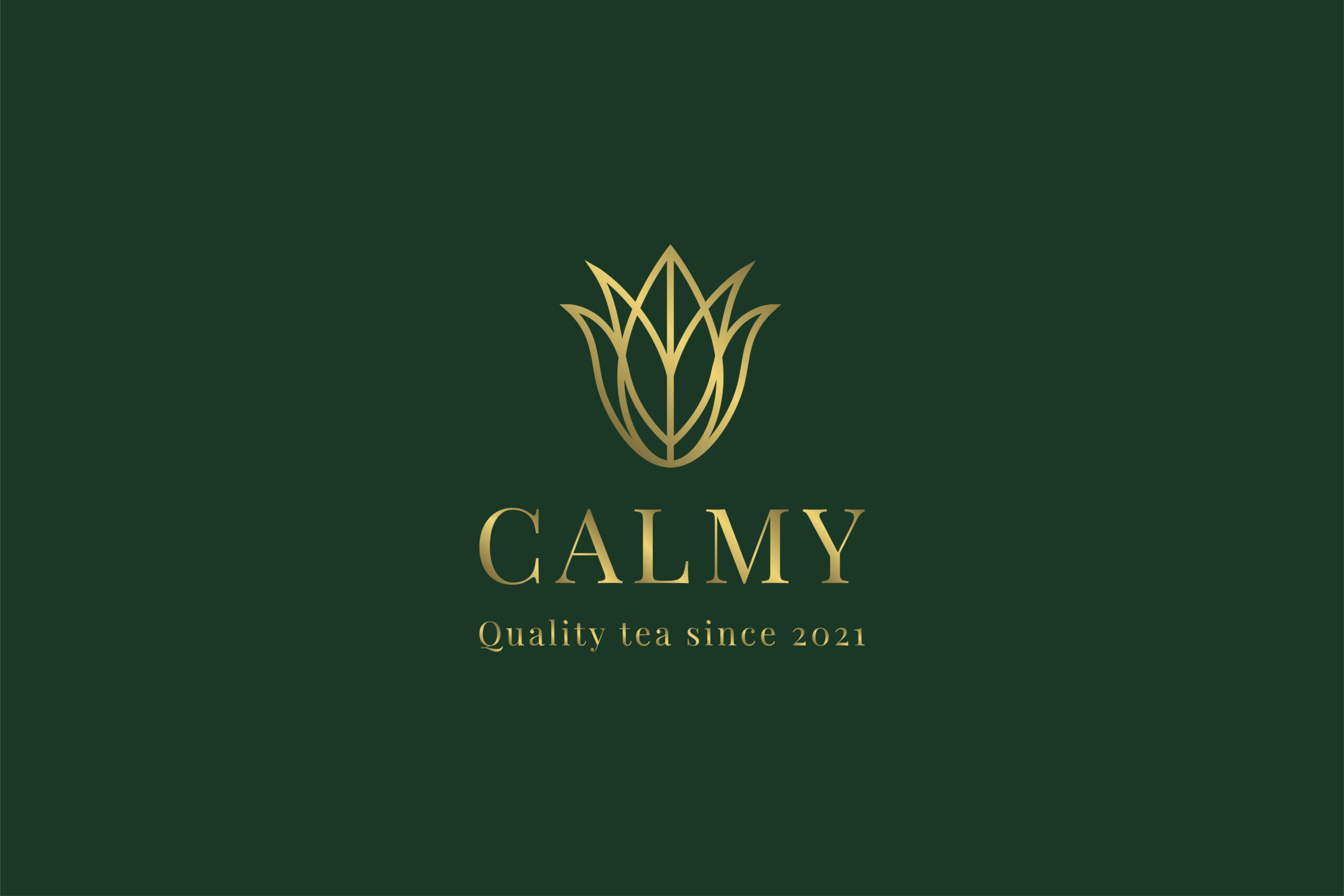
I chose to make a tea brand where the focus is quality and calmness with a luxurious touch. I went for the serif font Playfair Display for the logo and headings. For body copy I chose the sans-serif font Open Sans. The name of the brand is Calmy.

The website can only include typography, graphics and the usual UI elements – no photographs (find good references of sites that do this well).
Sketch your wireframe for your home page.


Design your home page in Figma.
I did unfortunately not have time to design the webpage in Figma.
Build your home page in Webflow.
Link to the website (Please note: the website is made for desktop and has not been mobile optimized): https://calmy-tea.webflow.io/
Video of the website before I added the triggers and interactions to it (before Lesson task 3.4):
3.3 Outline how you have optimised your site for performance
According to this video by Webflow, Webflow automatically creates variations of the image with different resolutions when it comes to inline images. But I have also reduced the file size of the images/illustrations by downloading them from Figma and reducing the file sizes in Figma. For the background image, I reduced the file size when exporting the image in Photoshop. Below you can see how the file size reduces when I reduce the image quality as well as reducing the image size in pixels.
Big file size (2,9 MB)

Medium file size (202,5 kB)

Small file size (146 kB)

3.4 Add triggers, interactions and animations to your website
I spent some time finding the right triggers/interactions for the website. To be honest, I think the selection of interactions and animations in Webflow is quite limited, and the animations in the library were a little bit too much for my website. I ended up using the action called “Pop” as this was the most “calm” animation that I could find that would also fit my website.
Link to website (Please note: the website is made for desktop and has not been mobile optimized):
Here is a video of all of the website with interactions:


