Develop a name for a dog food product. Design a logo for this product, using full colour. The logo must contain a main visual and typography. (Use the “People Saving Pets” logo as a guide – this does not mean your design should be the same, it is simply an example.) Follow each of the fundamental steps outlined above, in that sequence and take note of what needs to be handed in as you progress through these steps:
- Exploration – Use sketching techniques to draw thumbnails and hand in your thumbnails as scanned PDFs.
- Focus – Highlight three of the thumbnail ideas that you consider the best options and state why. Hand in an A4 with visuals of the three chosen thumbnails; include reasons for choosing each of these three options.
- Construction – Use sketching techniques and redraw ONE of your chosen concepts until you’ve reached a conclusion on a successful logo. Hand in your drawings as scanned PDFs.
- Testing – Experiment more with your favourite options from Step 3 and ask the opinion of a few people. Hand in examples of the logos shown to people and write their feedback or opinion on each.
- Refinement – Choose your final design and execute it in Adobe Illustrator, along with the name of the product. Hand in your final logo as an A4 PDF.
The first thing I did was to decide the name of the dog food brand. I wanted to avoid the obvious choices of name, and chose the same name as my dog: Storm. He is a Nova Scotia Duck Tolling Retriever (also known as “Toller”). Storm can also be associated with tough weather, and I therefore wanted to develop a dog food brand for adventurous dogs. Here is a picture of my dog Storm:

1. Exploration – Use sketching techniques to draw thumbnails and hand in your thumbnails as scanned PDFs.


2. Focus – Highlight three of the thumbnail ideas that you consider the best options and state why. Hand in an A4 with visuals of the three chosen thumbnails; include reasons for choosing each of these three options.

To the left: I chose to highlight this logo because it is simple, happy and playful. However, after some thinking, I realized that a serious name like “Storm” didn’t really fit a playful logo.
In the middle: I highlighted this logo because of it’s seriousness and realistic look. This is the one I chose to work further with.
To the right: I highlighted this because I liked the thought of an “S” wrapped around, almost like a tornado.
3. Construction – Use sketching techniques and redraw ONE of your chosen concepts until you’ve reached a conclusion on a successful logo. Hand in your drawings as scanned PDFs.


4. Testing – Experiment more with your favourite options from Step 3 and ask the opinion of a few people. Hand in examples of the logos shown to people and write their feedback or opinion on each.
Above: Feedback on the sketches: Many lines that are very close, maybe have fewer lines? The lines are very straight, consider bending them or soften them to resemble wind waves. Maybe have thicker lines? To keep the logo simple, remove the dog details like the nose and the eyes.

Above: This is the final logo sketch based on the feedback I got.
5. Refinement – Choose your final design and execute it in Adobe Illustrator, along with the name of the product. Hand in your final logo as an A4 PDF.

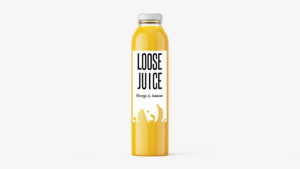
Here is the logo as a PDF:
Storm logo
Last ned PDF • 234KB