2.1 The components of visual identity
1. The three most important components of visual identity are colour, typography and logo
2. The difference between a logotype and a signature is that the logotype (also know as a word mark) is the brand name styled as a logo, while the signature is a combination between the logotype, brand mark and tag line.
Example of a logotype:

Example of a signature:

3. Colour scheme using only three colours
a. A luxury chocolate truffle brand that is made from real chocolate. The keyword here is ‘quality’

b. A courier company that delivers internationally by air, land and sea – their main focus is fast delivery.

c. An international insurance company that focuses on family values.

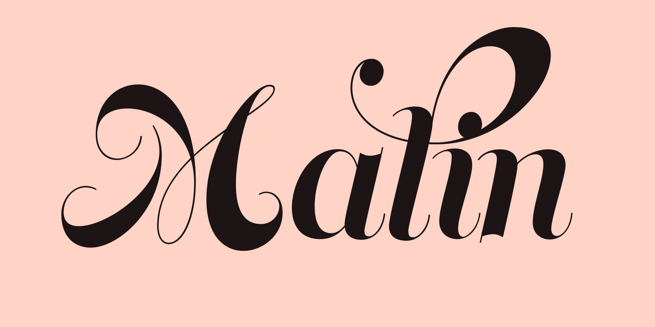
4. My name in four different typefaces
a. Expresses a unique quality about you: I chose this playful and creative font.

b. Is inspired by your favourite food: I have many different favourite foods, and one of them is sea food.

c. Makes your name look sophisticated: I really liked the uniqueness and sophistication of this font.

d. Connects you to a specific culture or ethnic group: I chose this font because it reminded me of Norwegian retro posters, especially those from the different Norwegian ski resorts.

2.2 Follow a leader
1. Choose a well established, international brand name. Some examples are H&M, Nike, Amazon, KFC, Mercedes, Virgin, Sony. You are free to choose another. Research the history and origin of the brand name and write down your findings.
Lego
The brand name I chose to work with is Lego, because of it’s interesting and fascinating story. The story of Lego goes all the way back to the early 1930’s, when a man named Ole Kirk Kristiansen had to close down his carpentry business. He had so much wood left, that he decided to start making wooden toys. In the 1940’s he bought a plastic molding machine, and the early version of Lego brick as we know it today, was born. But Ole needed a good name for his toy company. He played around with the Danish words “leg godt” which means “play well”, and just by merging those two words together, he had made the brand name “Lego”. What he didn’t know back then, is that Lego also means “put together” in Latin.
2. Compare the history of the name with the current logo and brand.
a. Write down your own conclusions about how the logo relates to its history.
The logo relates to it’s history by using the red colour, which has been used since the 1940’s. The logo today consists of a red square which I think has a good connection with the Lego brick.

b. Now write about how the logo or brand relates to its current target audience. Note if any changes were made to the original brand to achieve this or not.
The use of the colours red, yellow, white and black creates a very playful feeling and is also very easy to recognize. This relates to Lego’s most important target audience – children. The logo has been changed many times throughout the history, and has had different fonts and colours. The logo typeface that is today, has remained almost identical since 1954, but the shape and colours of the logo has been changed.

3. Collect examples of how this brand is applied across different platforms with at least five different touchpoints (for example, digital campaigns, social media, large format, signage, packaging, specialised campaigns and so forth). Discuss how a consistent visual identity was established across the different touchpoints. Consider the brand application in terms of logo, icon, colour, type, texture, photography etc.
Retail/Lego stores

Here you can see how the colours yellow and red are used to draw attention to the whole store (for example if you are standing in a shopping centre outside the store). Yellow is often considered a playful and happy colour with a lot of energy. The colour red works as a nice contrast to the yellow, and especially by using a red Lego brick right below the well known Lego logo.
Packaging

The logo on Legos packaging is strategically placed in the upper left corner. My theory is that it is placed there because of the way we read in the western world – from left to right. You can also see how the logo stands out from the blue background.
Social media – Facebook

When scrolling through Legos Facebook page, there are more videos than images. Many of the videos contain bright colours, and playful and happy music in the background.
Website


On their website, Lego creatively uses their Lego figures to display certain campaigns or offers, like the first image informing that you can get your presents delivered before Christmas.
Ads
Legos ads often includes happy children playing with the product. Sometimes you can only see the hands playing with the product. On the first image, you can see how the childrens clothes has got the same green and yellow colours as the product they are playing with. Another thing I noticed is that the table and the background is white, making the product stand out even more.


Source: https://www.lego.com/en-us/history/
2.3 Branding according to the book
Design according to a Brand Manual.
Pretend you’re on the editorial team of an airport company’s inflight magazine. The magazine is funded by advertisements, and the marketing team wants to pitch marketing plans to possible advertisers.
For this, they want to present examples of advertisements inside the magazine to the clients they approach, showing them what an advertisement inside the magazine could look like. You must apply the brand rules of these companies religiously.
You need to create two full-page magazine advertisements for this campaign. The first advertisement is for Starbucks. Here is a link to their online brand guide: https://creative.starbucks.com/. For the sake of this lesson task, you are allowed to find free substitute fonts that very closely resemble the prescribed Starbucks typefaces.
The second advertisement is for Audi. You can find their Brand Appearance guidelines here: https://www.audi.com/ci/en/intro/brand-appearance.html#.
Starbucks ad

Audi ad


