3.1 Focusing on design with a conscience
There are many street artists out there, both known and uknown. Futura, or Leonard Hilton McGurr is a famous street artist who is known for his graffiti and spray paint art. Futura has been an active street artist since the early 70s, and started out by painting illegally on New York Citys subway. He has been doing everything from painting backdrops on stage, to illustrate as a graphic designer.
Shepard Fairey is an American artist who is known for public art and stenciling. He started his artistic career by placing his drawings on skateboards and t-shirts in 1984. In 1989 Fairey created a sticker campaign named “André the Giant Has a Posse” while he was studying at Rhode Island School of Design. The sticker campaign grew to become the “Obey Giant” campaign, which he became famous for. Shepard Faireys probably most famous work, is the Barack Obama “Hope” poster series, which he created in 2008 to support Obama’s candidacy for president of the United States of America. Shepard Fairey is very much engaged in social and political topics.
Banksy
Probably the world’s most famous street artist goes by the name Banksy. He is still a mystery till this day, and people have been trying to uncover his identity for years. However, it has been said that his real name is Robin Gunningham, a 48 year old man born in Bristol. In 1990-1994, Banksy started as a freehand graffiti artist and was inspired by other local artists. He was often chased by the police, and one time he randomly noticed the stenciled serial number under a lorry, while hiding from the police. He then began to make stencils as they required less time out in the streets compared to painting on freehand.
Banksys style is characterized by the layered stencil effect, often painted in black and white. He is known for making art that has a lot to do with social and political topics. One of his most iconic artwork is “Love is in the air” (also known as “Flower thrower” painted on the West Bank Wall in Palestine in 2003. The artwork is a strong symbol for anti-war as the thrower looks like he is about to throw a bomb, but instead he is about to throw a bouquet of flowers. Personally, I think that this artwork has a strong meaning, and that it is a timeless piece of artwork that still works today in 2022.

Sources:
https://en.wikipedia.org/wiki/Futura_(graffiti_artist)
https://en.wikipedia.org/wiki/Shepard_Fairey
https://en.wikipedia.org/wiki/Banksy
3.2 Applying philosophy to design 1
*DISCLAIMER*
This post is about Covid-19 and vaccination. The poster is made for a school assignment as a graphic design student at Noroff, and I hereby disclaim all responsibility related to this post. You should always seek information about Covid-19 and the vaccination program from reliable sources like the Government or the Norwegian Institute of Public Health. Here are direct links to information about the Covid-19 situation and the vaccination program:
https://www.helsenorge.no/koronavirus
https://www.fhi.no/sv/smittsomme-sykdommer/corona/
https://www.regjeringen.no/no/tema/Koronasituasjonen/id2692388/
https://www.helsenorge.no/koronavirus/koronavaksine/
https://www.fhi.no/sv/vaksine/koronavaksinasjonsprogrammet/koronavaksine/
https://www.fhi.no/sv/vaksine/koronavaksinasjonsprogrammet/
Thumbnails

Take your shot now!
I decided to make a poster that encourages people to take the vaccine against Covid-19, since this is highly topical these days. The importance of taking the vaccine is huge as it not only has an impact for yourself, but for everyone around you. The hospitals have suffered a lot due to sick Covid patients, and many of the patients have not taken the vaccine.
I think my design might be provocative for someone, but I think that this pandemic has been going on for so long now (soon 2 years) that being more direct might help on communicating the message.
The poster is inspired by the constructivism movement and I was very inspired by the “Books” poster by Alexander Rodchenko. I have used a font that is inspired by Russian typography and the colours beige-white, black and red. Red is a colour that expresses energy, passion and danger, which I think fits this poster very well. Red is also the colour that is used in the logo of Red Cross which is an international humanitarian movement. The syringe is there to catch immediate attention, and to inform what the poster is trying to communicate.
Inspiration

The poster

3.3 Analysing the use of design fundamentals
I chose to analyse this poster by John Wan.

I think the fundamental of this poster is the drawing of attention to the Oscar statuette and how the pattern and lines points towards it. The use of negative space, contrasts and colours are also fundamental.
The poster reminds me a lot about vintage circus posters because of the use of red and white colours, and the stripes, shapes and ornaments. I think the designer was inspired by this because of the similarities between circus and the Oscars. They are both related to entertainment, and to be in the spotlight on a red carpet. I think it works very well.
I think in this illustration the balance between art and communication, the art is a little bit heavier and plays the dominant role. However, the communication is also an important aspect of the poster.
The first thing I would think about before making such a poster, is to draw only one side, as it is a symmetrical illustration with the line of symmetry in the middle. I think the colours work very well, both because the red colour can be drawn back to the circus posters, but also because of the connection to the red carpet. I would like to use lines to simulate a red carpet, and also to point towards the Oscar statuette similarly to what is done in this poster. I would like the viewer to focus on the Oscar statuette, as this is the most important part of the whole poster.
3.4 Applying philosophy to design 2
Inspiration
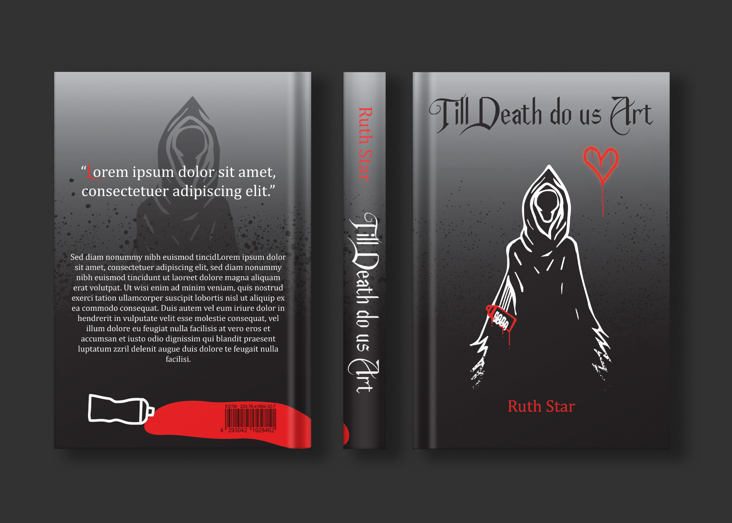
The book cover that I have designed is inspired by the stencil art style that Banksy use in his artwork.

Process
I got the idea of having the grim reaper holding a spray paint can instead of the scythe, and drew it by hand with pencil on paper. I then scanned it to my computer, and vectorized it in Illustrator. I also downloaded some brushes that look like spray paint.
Here is the drawing before editing in Illustrator:

Here is the final design in a mockup: